


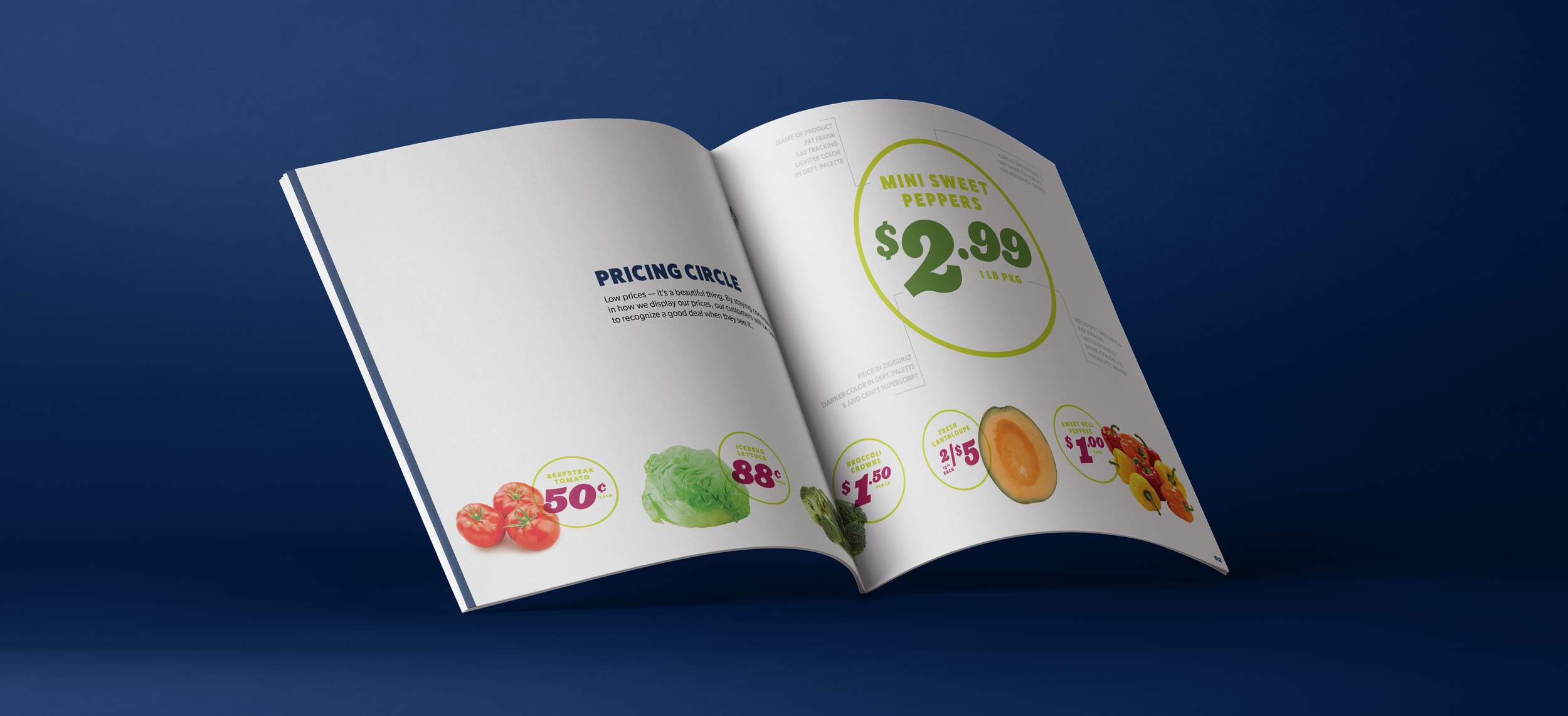


During this rebrand, we were tasked with giving Family Fare a new way to tell their fresh, local, affordable story - one that gets customers excited about grabbing a cart. Through every touchpoint within the store, their online presence as well as their TV and Radio commercials, we had designed a system to keep consumers informed while also giving them a reason to smile. I evolved their logo, was able to design areas of the store interior as well as over 3,700 point of sale touchpoints that subconsciously guided the shopper through the space.
Branding - Logo - Environmental Design - Social - Point of Sale
Copywriting: Dillon Platto + Brian Cusac
Interior Renderings: Andrea Davis